Feature: Real Leaders, Real Stories Video Library Search
Aurora users needed a better way to search over 1,300 two-minute videos made by executives who have successfully navigated challenges that employees face everyday.
Client: reacHire
Year: 2023
Skills: Research, User Experience Design
Technology: Miro, Figma
STEP 1: PROJECT ASSESSMENT
Testing the RLRS Search (Pre-Redesign)
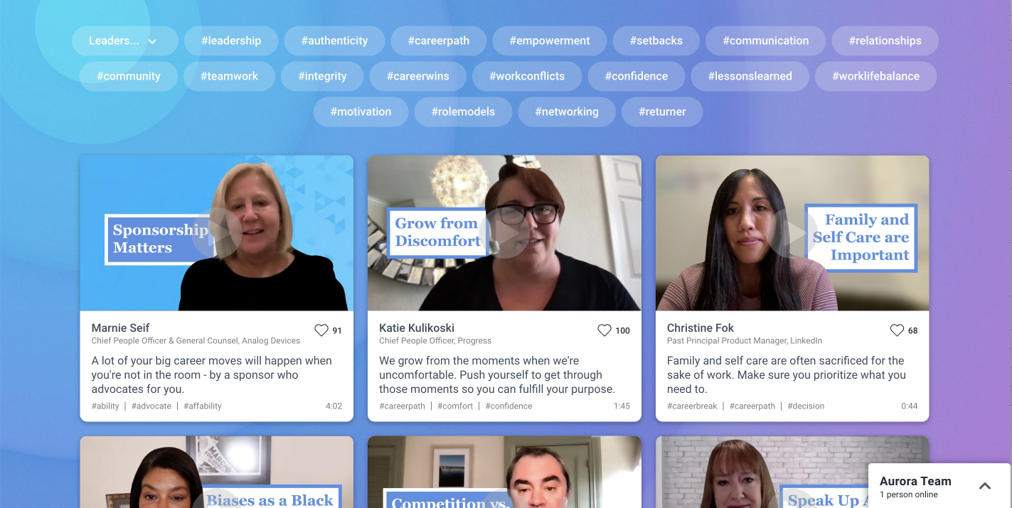
The layout of the search was acceptable, but trying to find a specific video was very cumbersome. The search was missing some key features like a boolean or keyword search. It was also missing basic usability heuristics like section headers and a list count. When I tried to search for specific videos, I found myself needing to scroll a lot and read through the all the descriptions because of the limited capabilities I had to conduct my search with. I also found the ‘hashtag’ terms hard to read and frustrating to scan.
STEP 2: DEFINING THE PROBLEM
Before I did anything, I created a problem statement so that there would be a clear definition of the problem that I was trying to solve. I am a UX Tutor at CareerFoundry, so I used the statement formatting in our curriculum that I teach my students everyday.
PROBLEM STATEMENT
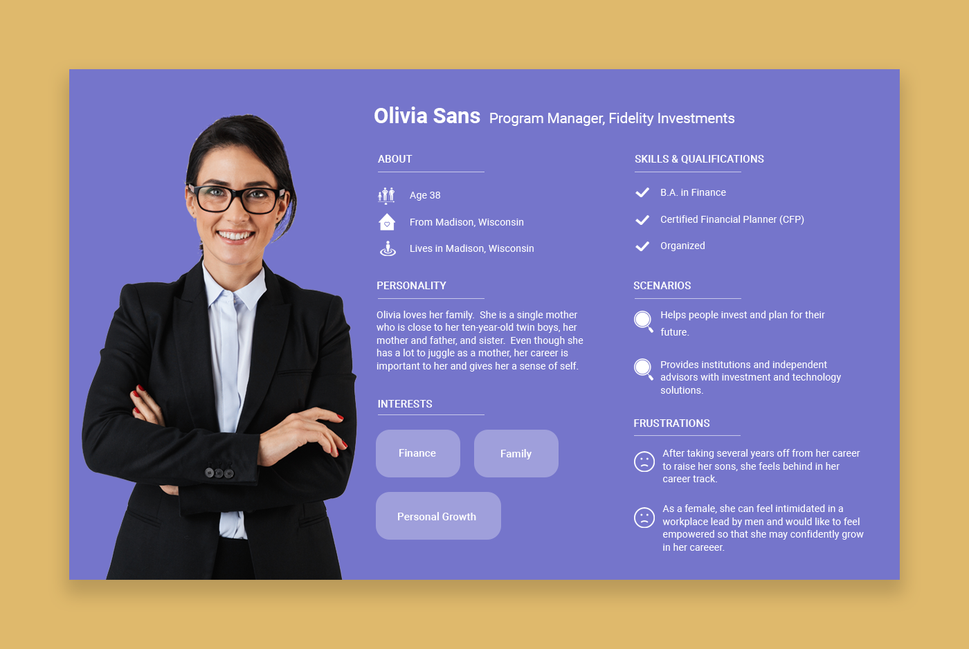
Olivia Sans (Aurora User), needs a way to search the RLRS video library because there are thousands of videos that will help her navigate workplace challenges that she faces everyday.
We will know this to be true when we see that Olivia can find videos, that address her specific challenges, quickly and without frustration.
STEP 3: PERSONAS
Once I clearly understood the problem, I wanted to get into the mind of the person who would be using the search. So, I created a primary persona that I could reference as I created and tested my designs.
STEP 4: COMPETITIVE ANALYSIS
Before I tackled redesigning the search, I needed to have a clear idea of what made a good (or bad) search and what features I needed to include. A competitive analysis was the perfect way to compare and contrast our current RLRS search with what other successful companies had done.
STEP 5: WIREFRAMES
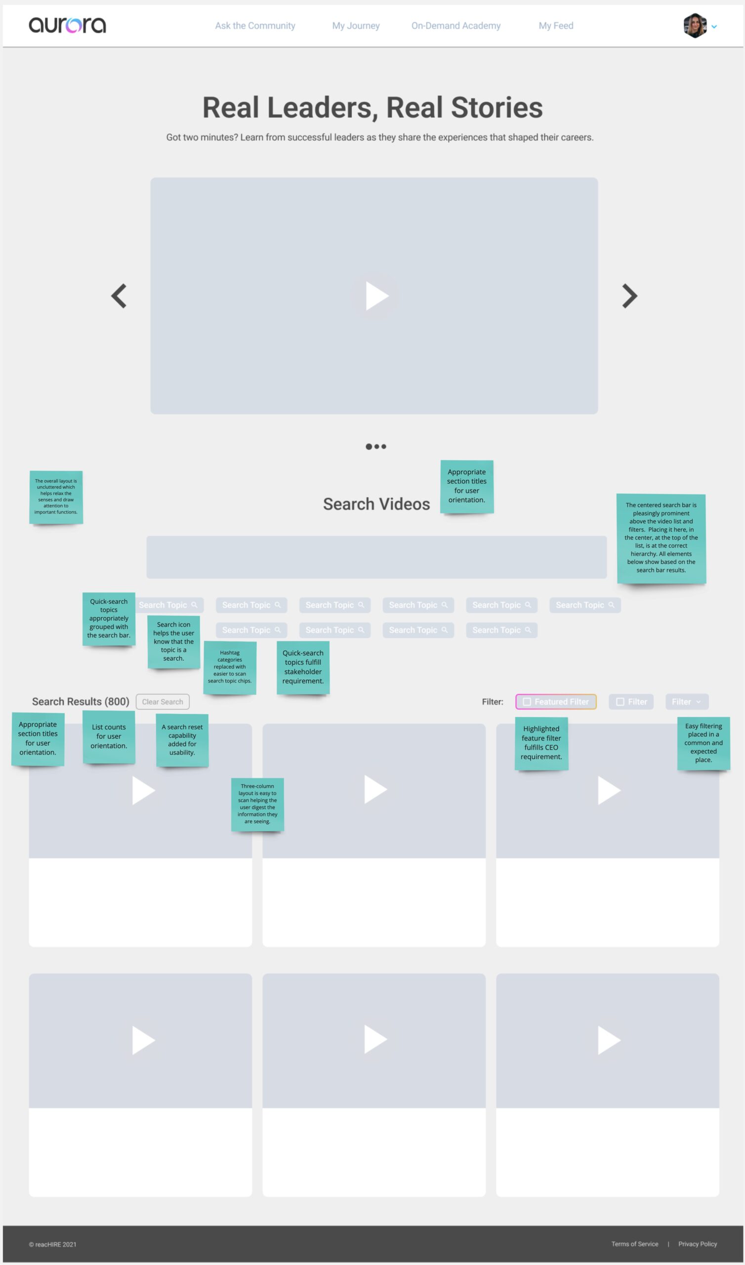
In creating the wireframes, I took all of the best features I’d seen in my competitive analysis (marked by the green stickie notes) and applied those features to my design. I also added some of my own changes that I knew would create a more seamless search experience such as taking out hashtag categories and adding in a way to reset a search. Lastly, I had to accomodate for some design constraints set by the stakeholders and the CEO.
Constraints:
- Must fit seamlessly into the current UI using styles already defined by the software design system
- Cannot change list card information
- Must have popular search topics (Stakeholder Request)
- Must have a highlighted company filter (CEO Request)
STEP 5: HIGH-DEF DESIGN
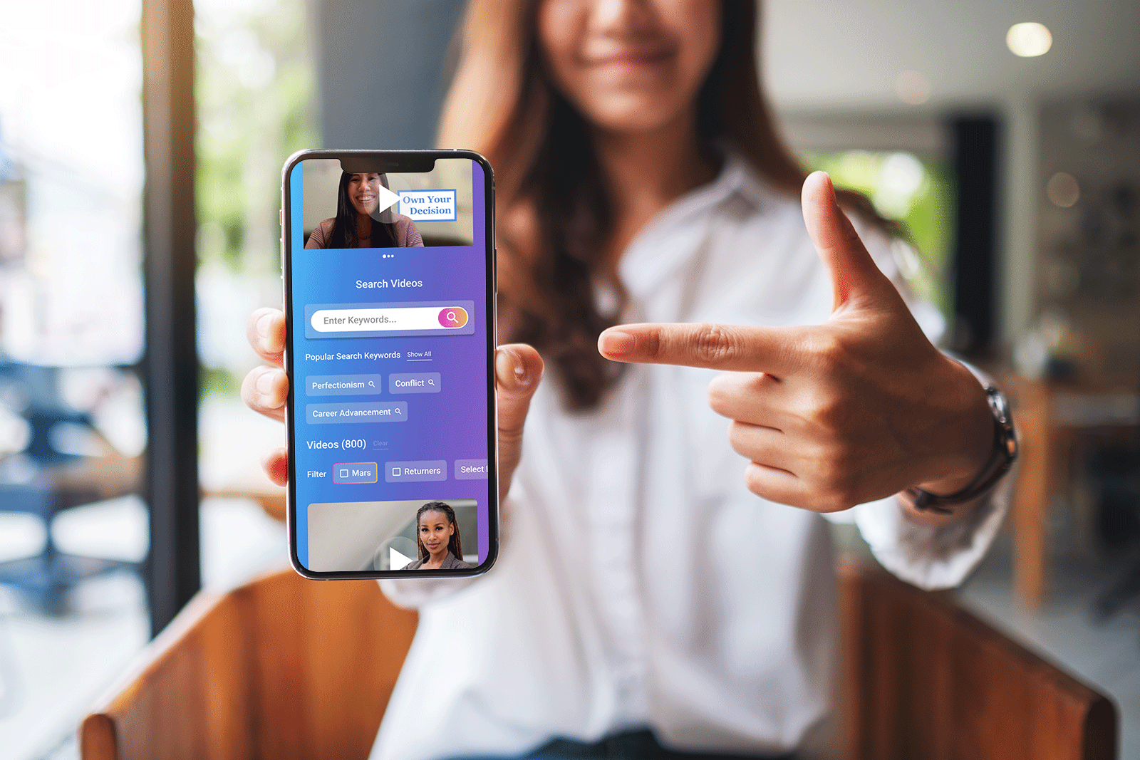
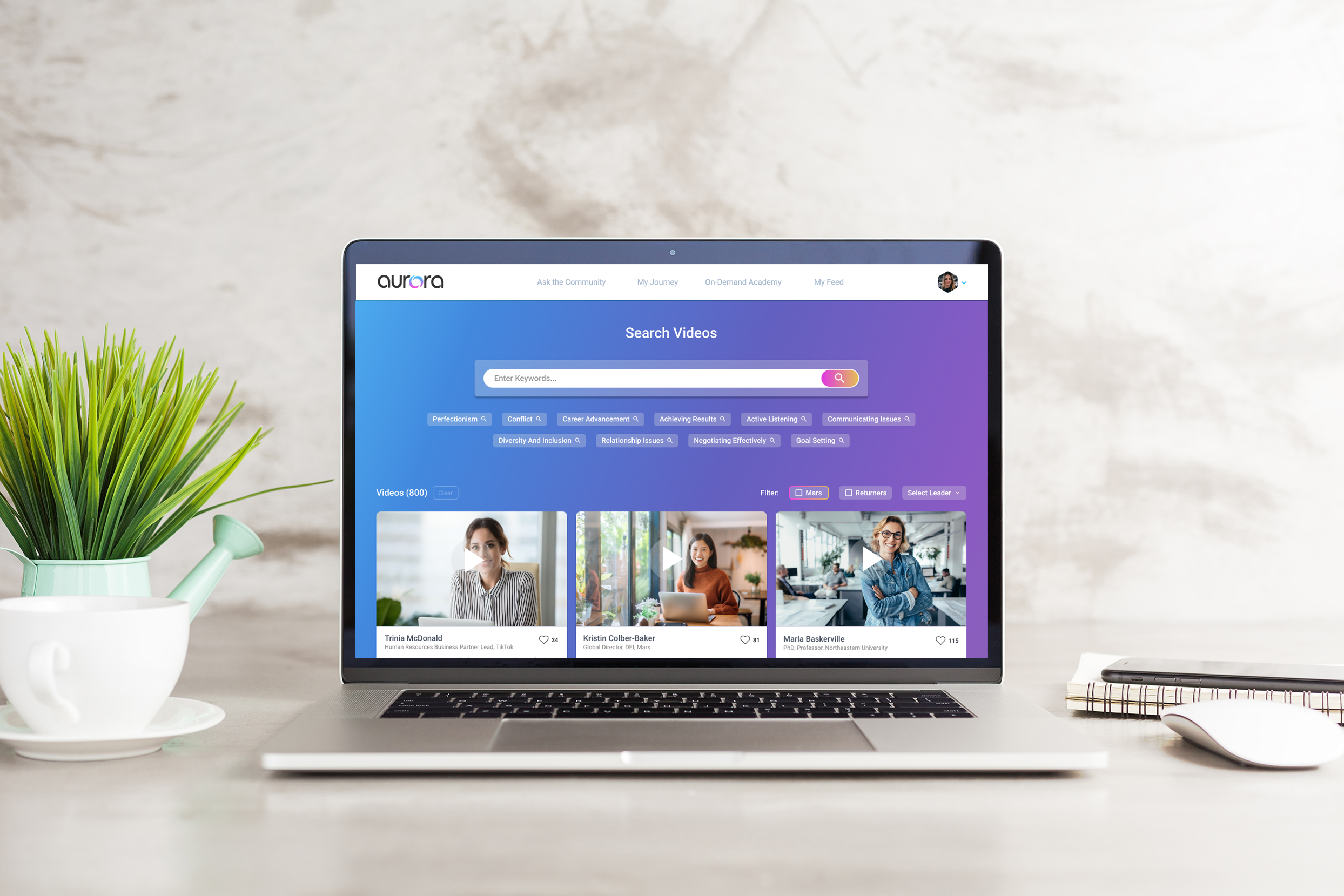
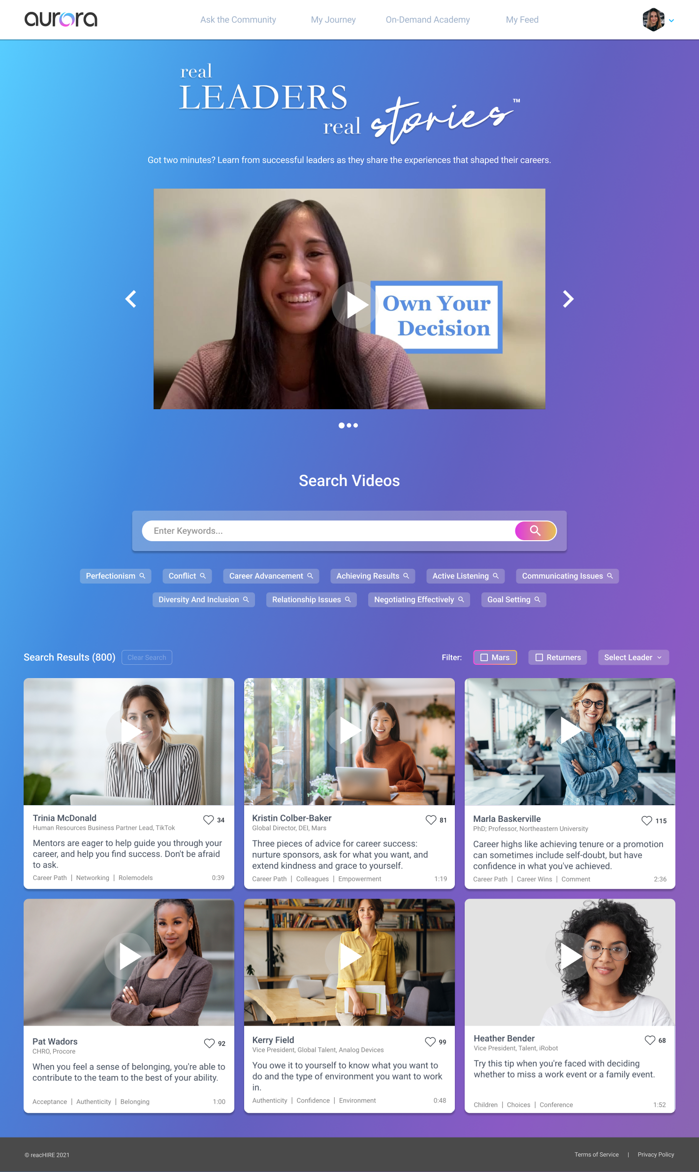
Once I knew the layout and all of the features that I needed to include, I created the designs for web and mobile in Figma using Aurora’s Style Guide.
Web High-Def:
Mobile High-Def:

STEP 6: PROTOTYPE
Even though the search was seemingly simple, it was important to build a prototype so that I could get a feel for all of the nuanced interactions within the different use cases. The prototype ensured that all of the interactions were seamless and searches did not create unneeded frustration.
Notable Use Cases:
- A user types keywords in the search box and then clicks on a quick search chip.
- A user types keywords in the search box, clicks search, and then clicks on a quick search chip.
- A user clicks on a quick search chip and then clicks another quick search chip.
- A user clicks on a quick search chip and then types keywords in the search box.
- A user types keywords in the search box, then clicks search, and then uses a search filter.
- A user interacts with the search and there are no search results.
Web Prototype:
Mobile Prototype:
