Project: An overhaul of the SMART Suite
Action Against Hunger (AHG) wanted to improve the suite of tools they use to collect, manage and visualize big data analytics from health surveys they conduct around the world.
Client: Action Against Hunger
Year: 2020
Skills: User Research, Information Architecture, Interaction Design, UI Design Support
Technology: Invision, Balsamiq, Sketch
PROJECT BACKGROUND
Who is Action Against Hunger (AGH)?
A non-profit and global leader in the fight against life-threatening world hunger.
The need for BIG DATA
AGH pinpoints starving areas around the globe by sending survey teams of Enumerators to rural communities so they can collect health data from different populations.
Technology Improving the Process
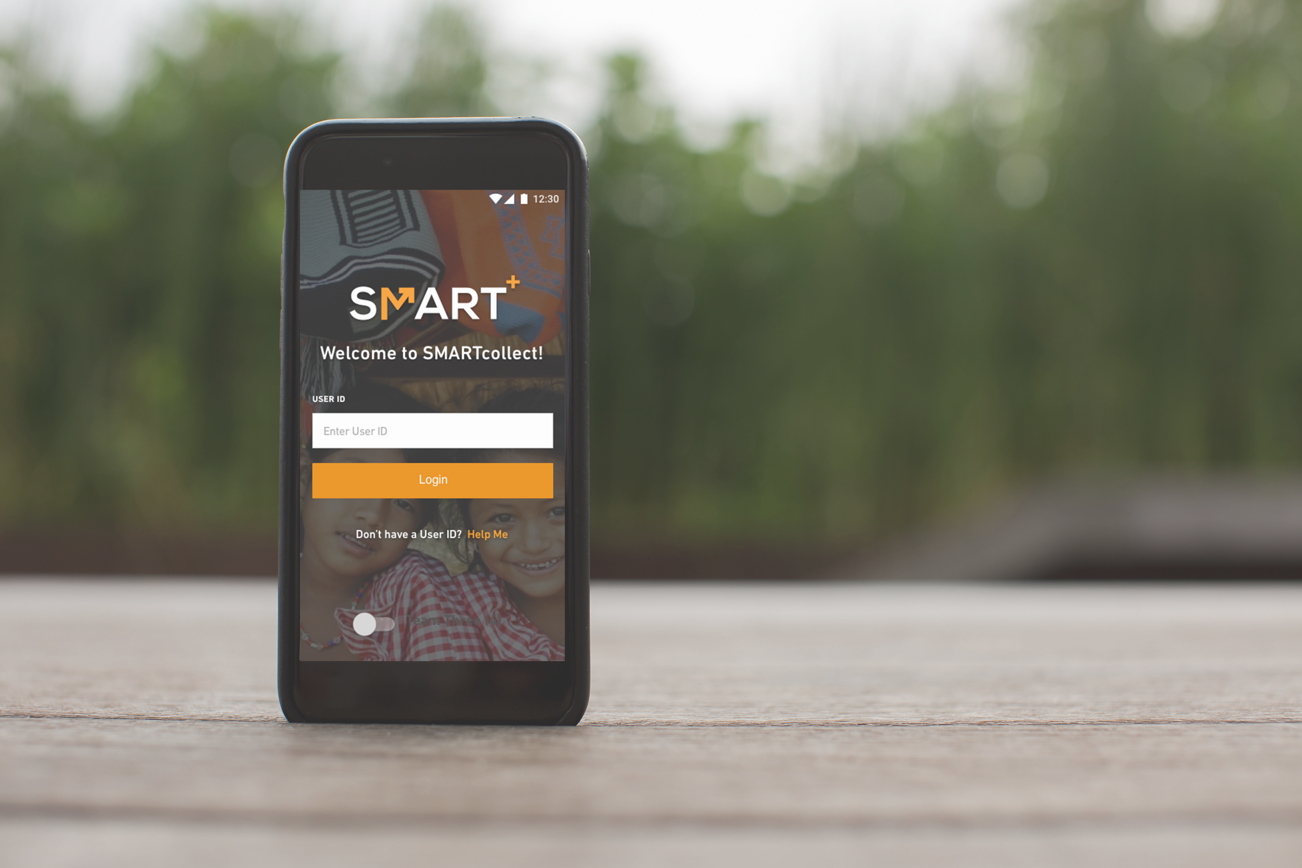
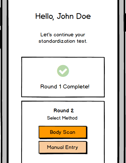
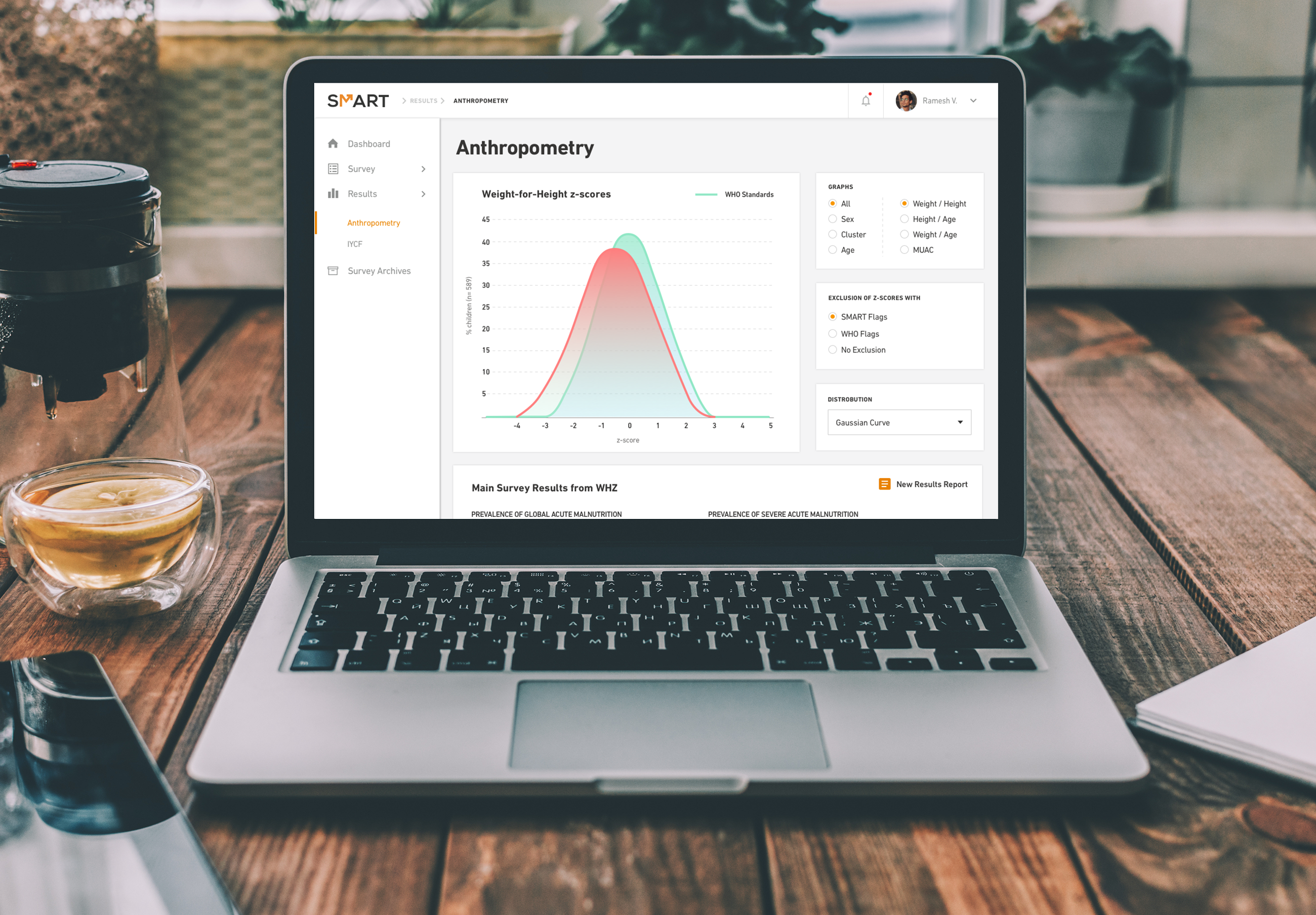
AGH uses SMART+, a big data analytics software that visualizes the data they collect from field surveys. AGH also wanted to create SMARTcollect, a mobile application that would to allow Enumerators to collect and send survey data from field environments directly to Smart+, moving them away from inefficient paper-based, manual-entry processes.
STEP 1: ASSESSING THE PROJECT
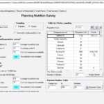
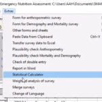
First, I ran a heuristic evaluation on SMART+ and tested their paper-based processes to gain an understanding of the issues that they were having. I also had several training sessions with the AGH team and learned how to be a survey manager so that I could step into their shoes as I designed the softwares and created new processes.
From my evaluations, I found that there were six primary issues with their current software and data collection processes.
- The information in the software is disorganized and hard to understand.
- The software didn't direct users how to begin, end, or manage a survey.
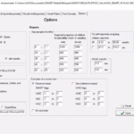
- Unncessary functionality drew attention away from important functions.
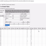
- Data entry was arduous causing high amounts of human error.
- There was no place to track or manage an in-progress survey.
- The software was heavy and outdated which contributed to decreased cognition and slower adoption.
STEP 2: PERSONAS
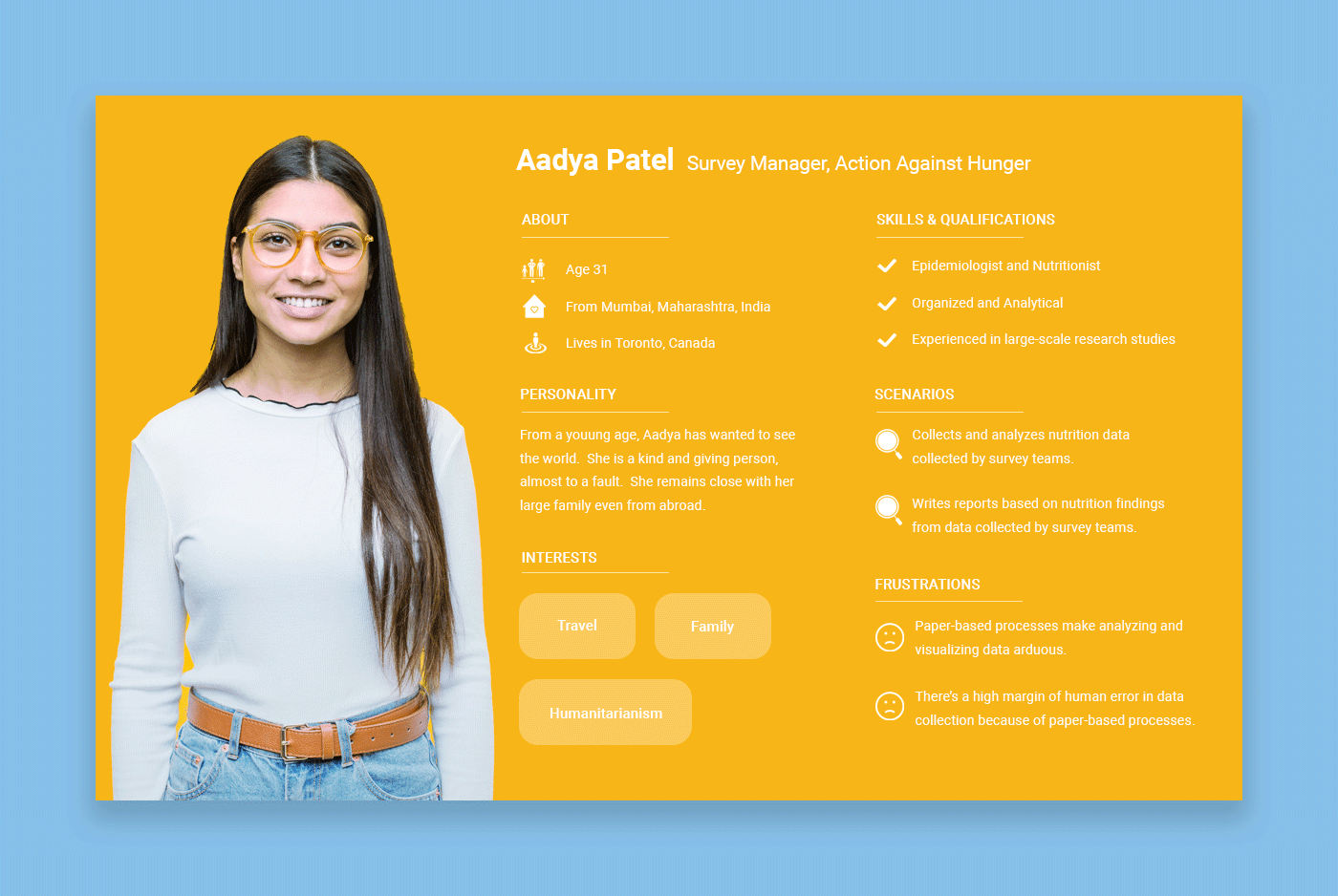
Once I understood the problem, I created a primary persona so that I could better understand the type of person I was designing the software for.
STEP 3: INFORMATION ARCHITECTURE & VISUAL DESIGN
Below, I’ll walk you through our solutions for each of the six issues that I listed above and how it transformed SMART into a new-and-improved suite of tools.
Issue No. 1
- The information in the software is disorganized and hard to understand.
Recommended Solutions:
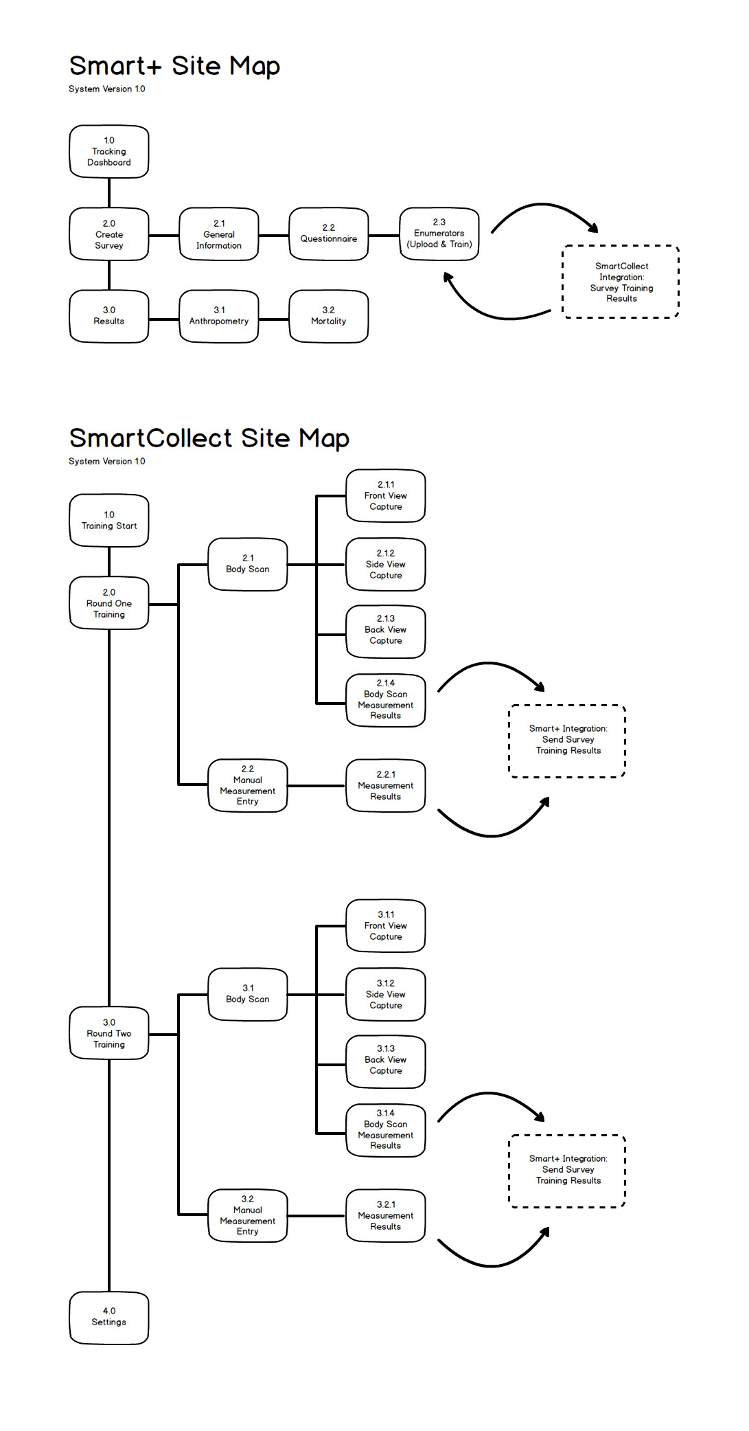
Information Architecture Overhaul: We redesigned the architecture of all global navigations and sub-navigations for simplification, logical groupings, and plain-language naming conventions.
Issues No. 2 & 3
- The software didn't direct users how to begin, end, or manage a survey.
- Unnecessary functionality drew attention away from important functions.
Recommended Solutions:
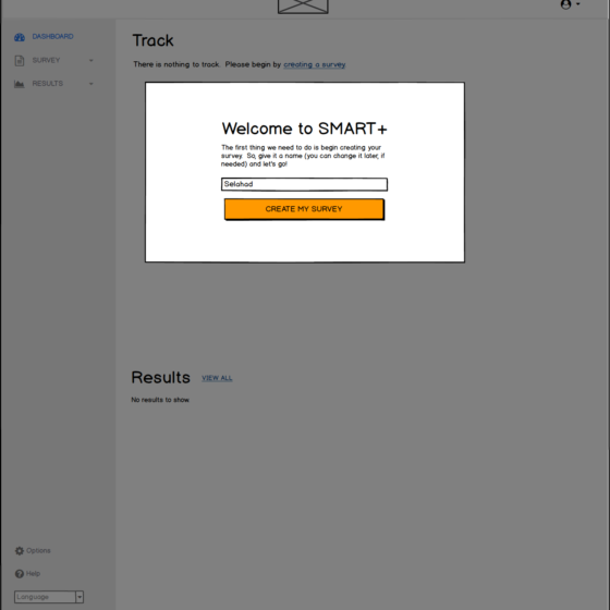
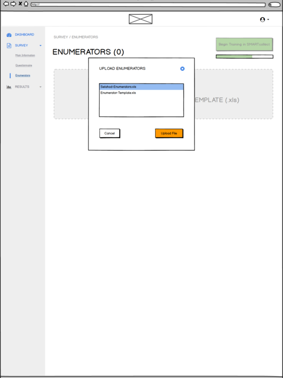
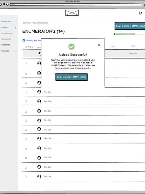
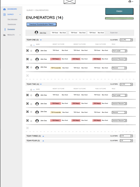
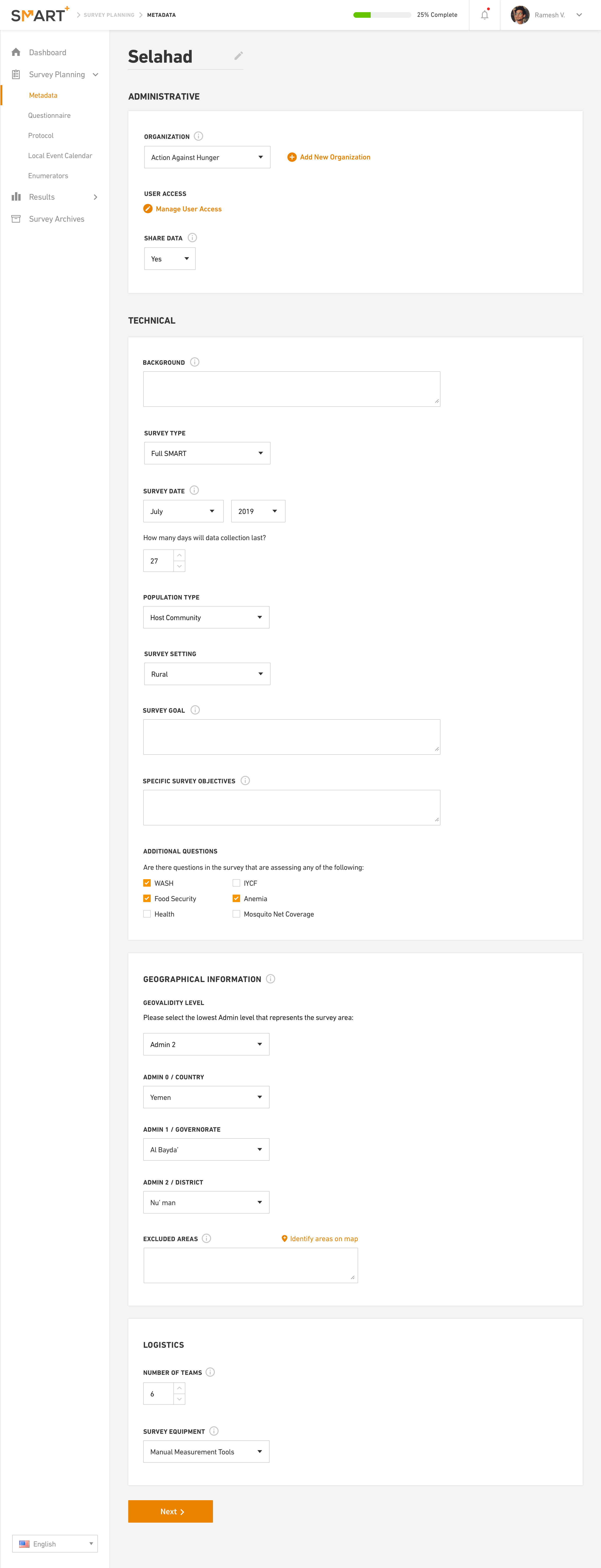
Usable Workflows and Wizards: The creation of surveys, questionnaires, and Enumerator training was designed as a step-by-step workflow (or wizard ) to guide users through important tasks in an easy to understand way.
Prioritization of functionality: We interviewed Survey Managers and Enumerators to remove unnecessary functionality and streamline their workflow.
Issue No. 4
- Data entry was arduous causing high amounts of human error.
Recommended Solutions:
Standardized data collection: We made data collection templates to create consistency across all survey teams. This makes the data more accurate and easier to track.
Bulk uploads: We added bulk uploading to make data import quicker, easier, and with less human error.
Template validation: We added template validation to reduce human error.
Issue No. 5
- There was no place to track or manage an in-progress survey.
Recommended Solutions:
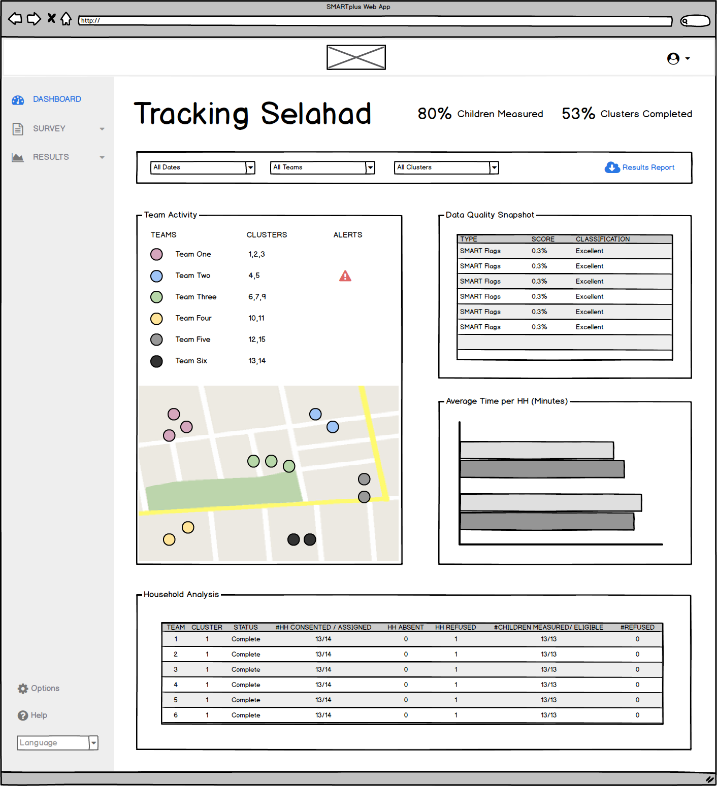
We added a Survey Tracking Dashboard so a Survey Manager could:
- Conduct project management duties, such as time keeping and survey team tracking.
- Receive real-time data, analytics, and visualizations.
- Quickly view new results, analyze findings, and download reports.
Issue No. 6
- The software was heavy and outdated which contributed to decreased cognition and slower adoption.
Recommended Solutions:
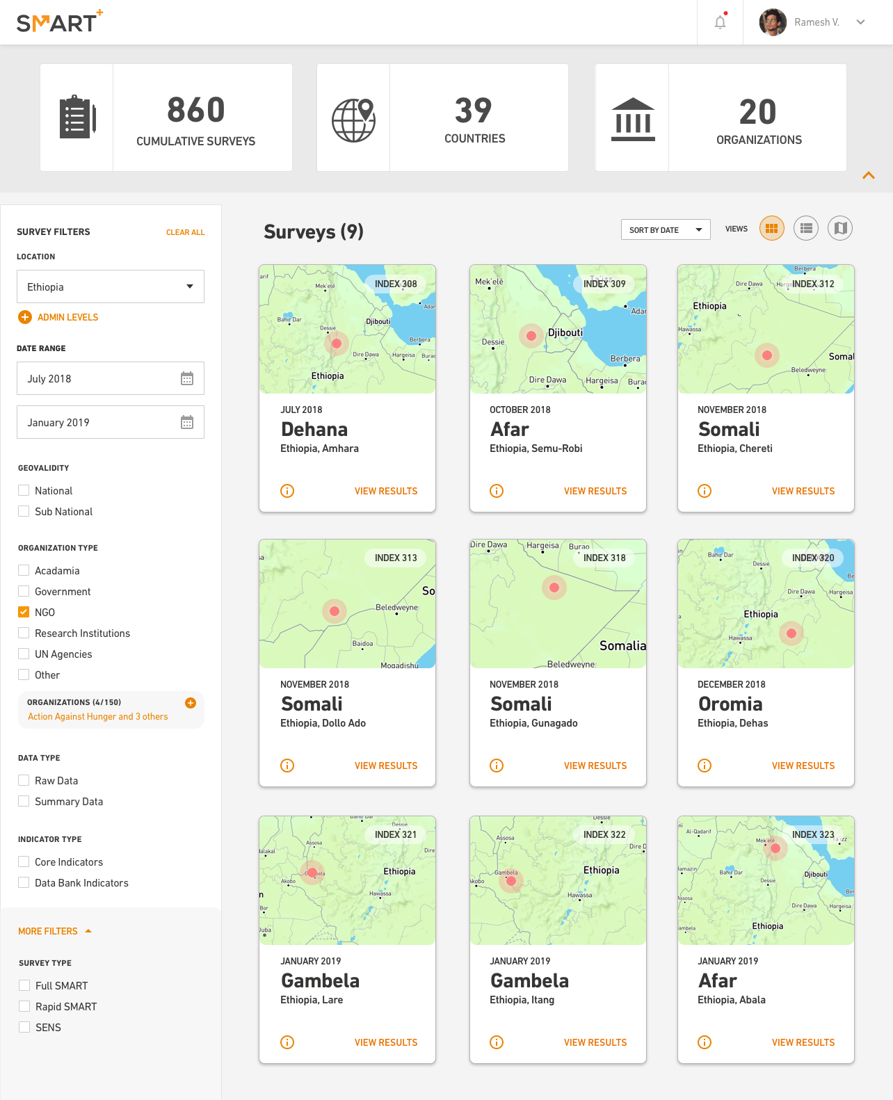
Whitespace and a light color pallet: Color and whitespace, when used correctly, increases cognition and decreases cognitive load. I recommended that we use both to lighted cognitive load.
Enlarged elements and increased spacing: Enlarged elements and increased spacing decreases eye strain. By adding both, we made everything easier to read and see.
Text and alignment: We formatted everything to flow with natural reading tendencies (F and Z scanning). Properly formatted elements and copy allow users to read with speed and retention.
*Note: I worked with another designer who was the lead Visual Designer for this project. Any recommendations above are based the research I conducted in my role as lead Researcher and IA.
STEP 4: Prototypes
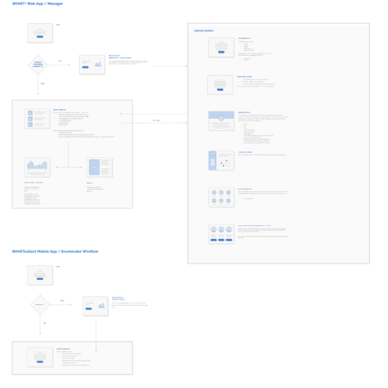
We built out wireframe and high-definition prototypes. It was important for the AGH team to get a clear picture of how the software would look and feel. We also needed to make sure that AGH was on board with all of our design decisions throughout the process.
